Zsh Mailing List Archive
Messages sorted by: Reverse Date, Date, Thread, Author

Re: CSS for Zsh website?


Yes, but rather than speaking in the abstract, let's be concrete.  Using the URL Peter posted, this is fairly impenetrable for me (and perhaps most users):
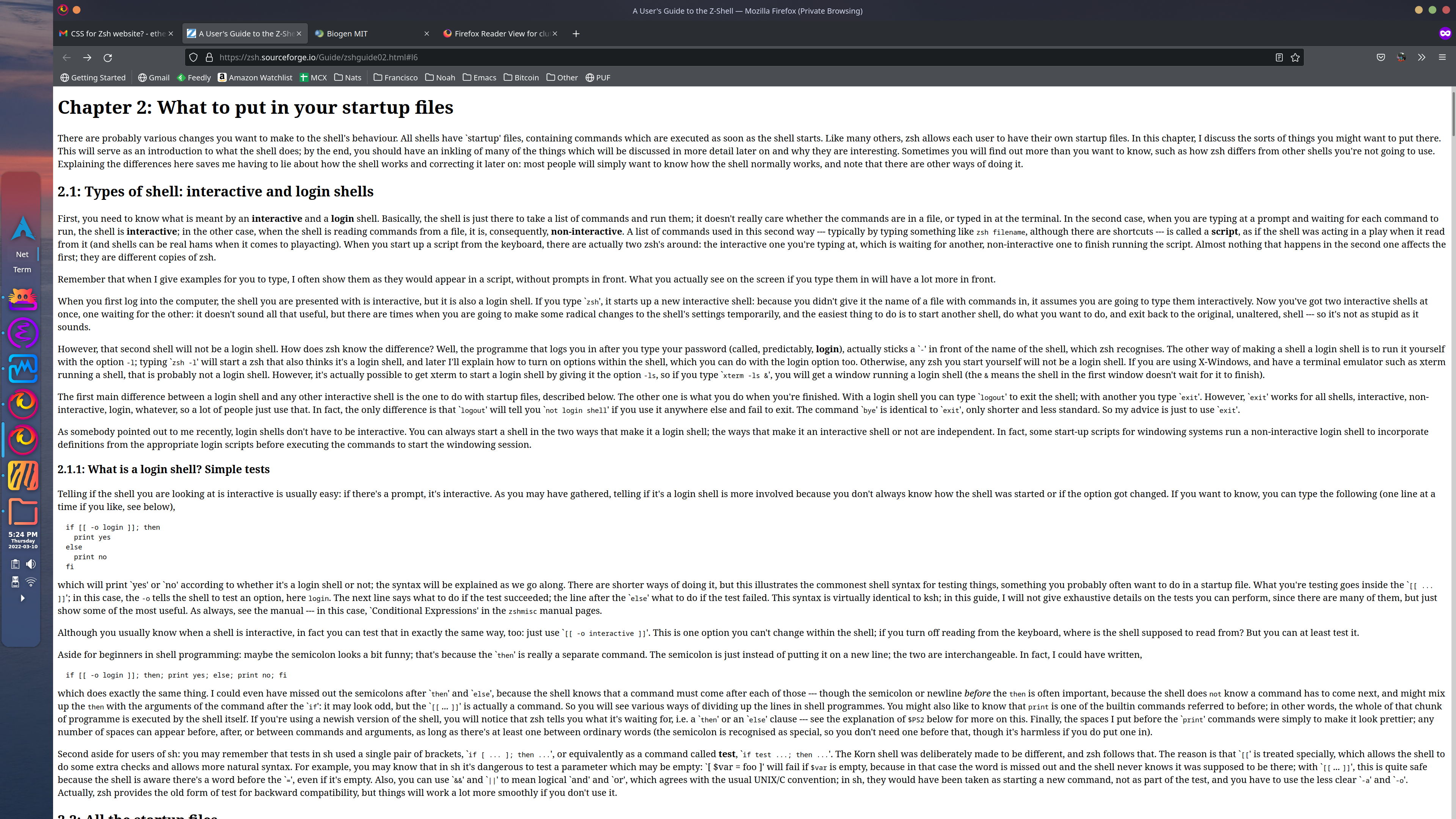
image.png
in particular, tracking from the right edge, skipping a line, and jumping to the left edge is a fairly low probability event.  Also, my eyes have difficulty tracking in the middle of most lines.

Using a reader makes a big difference (at the cost of some real estate):
image.png
The original proposal was to put some CSS limitations in place, so the standard mode looked more like reader mode; I seem to be one of the few respondents in favor of this proposal.

Regards,
  Vin


On Thu, Mar 10, 2022 at 4:30 PM Clinton Bunch <cdbunch@xxxxxxxxxxx> wrote:

On 3/10/2022 3:12 PM, Lawrence Velázquez wrote:
> On Thu, Mar 10, 2022, at 12:17 PM, Clinton Bunch wrote:
>> A web page should mostly be left in the hands of the user
> A nice thought, but in practice the vast majority of users only
> ever see the defaults chosen by the website author.
But some don't, like people who prefer dark backgrounds or need a 15pt
font to read.  Browsers have customizable defaults for a reason. 
Overriding those should require a reason other than it's what I like.
>
>> We are Unix people, a platform built on flexibility.  You have created
>> one of the most flexible shells in existence.  (Which is why I've used
>> it for 25+ years)  The website should reflect that flexibility.
> I do not think projecting the sensibilities of an operating system
> onto a website is a recipe for making a good website.

Flexibility is a key and often overlooked aspect to a website. People
have different width screens, so setting things in pixel (or character)
widths can make a web page look like crap.  It's quite frustrating when
a website says "Best viewed at 1024x768" or some such.

What fancy design do you see the Zsh Website needing?  Drop down menus? 
Floating ads?  The fanciest thing I can see us needing is a side bar
with a width set in ems.  We don't need to control every aspect of the
user experience to get our message out there.


Messages sorted by: Reverse Date, Date, Thread, Author